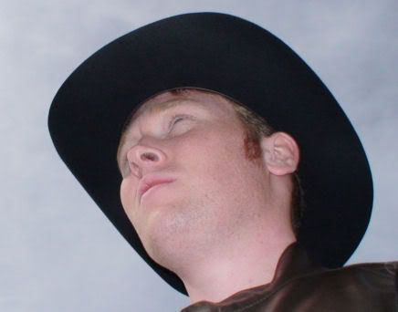
Sammy Gordey Stewey has redeemed himself with his latest, and timely, reply to my email sent less than a day ago:
Dear Clayton,
My sincere apologies for my tardiness in responding to your question.
I must admit that your analysis of the Samuel's Persiflage logo in intriguing, and I have to wonder how much time you spent analysing it. Possibly the most interesting thing about your analysis is how it has taken what was a simple idea in my head, and turned it into something far more complex.
My idea for the logo was simple, it was symbolic of the talking which would form the basis of Samuel's Persiflage, a speech bubble containing the name of the podcast. I also intended on having a speaker visible somewhere as an extra auditory symbol. The colours were supposed to be fairly simple, and they were. I enjoy using basic colours, I also enjoy creating two dimensional artworks.
The logo was a culmination of these factors, and roughly the picture I had in my head. It does stand out amongst the mass of podcast logos as it doesn't really follow the trends of artistic logos, which I suppose shows that it isn't going to be a podcasted attempt at regurgitating popular FM radio breakfast show trends, in fact it is quite the opposite, it is my own variation of an AM talk show.
Whilst I was only thinking of the artistic side of the logo while I was designing it, I am glad to see that it does represent what the show is all about.
Once again I apologise for not getting back to you sooner.
Regards,
Samuel
Clayton Northcutt.


No comments:
Post a Comment