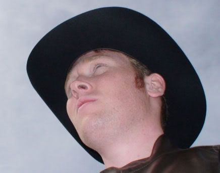
From here-on in follows my most recent email to the talented young Samuel:
Samuel,
I felt that this needed to be said. In regards to your latest "Samuel In Dolgnwot" episode (Gordon-Stewart, 2006), I have to say that I am disappointed in your apparent lack of colour arrangement for your background. Far be it from me to tell you how to draw and design your own cartoon, however, in the bottom left corner you appear to have used the burgundy colour in two boxes beside each other (Gordon-Stewart, 2006). Perhaps in the future you might like to use something like a cyan, an aubrey or something more distinct?
I have been a great fan of the "Samuel In Dolgnwot" series, both the first (Gordon-Stewart, 2005) and second (Gordon-Stewart, 2005/2006), and eagerly anticipate the third. However, I would not like the high standard and quality of these picture, as well as the individuality (as these pictures, clearly coming from quite a uniquely talented nineteen year old, are not something you see every day) to slip, and ultimately affect the entire standard of the third series, in comparison to the supreme first (Gordon-Stewart, 2005) and second (Gordon-Stewart, 2005/2006).
Keep up the good work Samuel.
From,
Clayton Northcutt.
Sources:
Gordon-Stewart, Samuel (2005). Samuel's Blog. Retrieved August 6, 2005, from http://samuelgordonstewart.com/
Gordon-Stewart, Samuel (2005/2006). Samuel's Blog. Retrieved March 14, 2006, from http://samuelgordonstewart.com/
As I say, far be it from me to tell the young lad what to do with his pictures, they are, after all, his pictures. However, I felt it needed to be done: that someone get onto the boy about this creative lapse and, before if begins to affect any more of his pictures, thus he can remedy it.
I also thought that, for his convienience, I should cite the works of his that I was discussing with him. Hopefully he appreciates my efforts and comments.
Clayton Northcutt.


No comments:
Post a Comment